| 14. ribbon | ||
|---|---|---|
 | Chapter 4. Reference |  |
| 14. ribbon | ||
|---|---|---|
| | Chapter 4. Reference | |
<ribbon
  name = NMTOKEN
  helpId = NMTOKEN
  rows = strictly positive int : 3
  insert = non empty token
  replace = non empty token
  replaceEnd = non empty token
>
  Content: [ insert |
             div | span |
             action | tool | separator | spacer | button |
             ribbonItems ]*
</ribbon>

<insert />

<div
  name = NMTOKEN
  label = non empty token
>
  Content: [ span |
             action | tool | separator | spacer | button ]+
</div>

<span
  name = NMTOKEN
>
  Content: [ action | tool | separator | spacer | button ]+
</span>

<action
  name = NMTOKEN
/>

<tool
  name = NMTOKEN
/>

<separator
  line = boolean : true
/>

<spacer />

<button
  name = NMTOKEN
  label = non empty token
  icon = anyURI
  selectedIcon = anyURI
  toolTip = non empty token
>
  Content: action | menu
</button>

<menu>
  Content: [ action | separator ]+
</menu>

<ribbonItems
  name = NMTOKEN
/>
Specifies a kind of “structured” tool bar, generally having more than one row of buttons.
By default, a ribbon has 3 rows of buttons, however the stock ribbon of the XXE desktop application has just 2 rows of buttons. Buttons are added to a ribbon from top to bottom and from left to right. Example:
<ribbon rows="2" name="ribbon">
  <div name="file" label="File">
    <action name="newAction" />
    <action name="saveAction" />
    <action name="openAction" />
    <action name="saveAllAction" />
  </div>
  ...
A ribbon contains directly or indirectly references to action, tool and ribbonItems elements declared elsewhere in the GUI specification.
The insert child element, the insert, replace, replaceEnd attributes may be used to customize to the previous definition of a ribbon. More information in Customizing a composite part without redefining it from scratch.
A ribbon may also contain the following child elements:
buttonA button is generally used to override the label, icon, selectedIcon and toolTip attributes of the action it contains. That is,
<button><action name="openAction"/></button>
is strictly equivalent to:
<action name="openAction"/>
By default, a button is rendered as an icon —the icon specified for the action— and has no label. Specifying a label attribute
<button label="Open">
  <action name="openAction"/>
</button>
adds this label to the right of the icon:

Additionally specifying an icon larger than 16x16 pixels[4],
<button label="Open" icon="icons/32/openAction.png">
  <action name="openAction"/>
</button>
moves the label below the icon:

Note that unlike small buttons having 16x16 icons, such “large buttons” occupy more than one row of the ribbon and may cause subsequent buttons to be added to a different column.
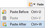
A button may also contain a menu of actions. Example:
<button icon="icons/pasteAction.png" label="Paste">
  <menu>
    <action name="pasteBeforeAction" />
    <action name="pasteAction" />
    <action name="pasteAfterAction" />
  </menu>
</button>
In such case, the button must have at least an icon attribute. Moreover a triangle down symbol is automatically added to this icon to suggest that clicking the button displays a popup menu.
Optional name attribute makes it simpler customizing the ribbon element which is the ancestor of the button element. See Customizing a composite part without redefining it from scratch.
separatorInside a ribbon, a separator has an optional line attribute which defaults to true.
A separator having attribute line="true" is rendered as a vertical line.
Inside a span, a separator having attribute line="false" is rendered as a small space.
Inside a ribbon or a div, a separator having attribute line="false" may be used as a “column break”. Example, notice how button "saveAllAction" is added to a new column:
<action name="newAction" />
<action name="saveAction" />
<action name="openAction" />
<separator line="false" />
<action name="saveAllAction" />
spacerOccupies the same space as a button having a 16x16 icon and no label. Example, the spacer is added below button "openAction" and causes button "saveAllAction" to be moved to a new column:
<action name="newAction" />
<action name="saveAction" />
<action name="openAction" />
<spacer />
<action name="saveAllAction" />spanA horizontal group of buttons. Example, using spans rather than relying on the top to bottom/left to right order of the buttons:
<div name="file" label="File">
  <span>
    <action name="newAction" />
    <separator line="false" />
    <action name="openAction" />
  </span>
  <span>
    <action name="saveAction" />
    <separator line="false" />
    <action name="saveAllAction" />
  <span>
</div>
Optional name attribute makes it simpler customizing the ribbon element which is the ancestor of the span element. See Customizing a composite part without redefining it from scratch.
divA group of buttons generally having a label. Consecutive div elements are automatically separated from each other by vertical lines. Example, a "File" div followed by an "Edit" div.
Optional name attribute makes it simpler customizing the ribbon element which is the parent of the div element. See Customizing a composite part without redefining it from scratch.
![[Note]](images/note.svg) | |
A ribbon may directly contain |
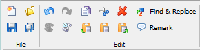
Example, the stock ribbon of the XXE desktop application:
<ribbon rows="2" name="ribbon" helpId="ribbon">
<div name="file" label="File">
<action name="newAction" />
<action name="saveAction" />
<action name="openAction" />
<action name="saveAllAction" />
</div>
<div name="edit" label="Edit">
<action name="undoAction" />
<action name="repeatAction" />
<action name="redoAction" />
<action name="commandHistoryAction" />
<separator />
<action name="copyAction" />
<action name="pasteBeforeAction" />
<action name="cutAction" />
<action name="pasteAction" />
<action name="deleteAction" />
<action name="pasteAfterAction" />
<separator />
<button name="searchReplaceElementButton" label="Find & Replace">
<action name="searchReplaceElementAction" />
</button>
</div>
<ribbonItems name="configSpecificRibbonItems" />
</ribbon>Example, add a "Remark" button after the button called "searchReplaceElementButton":
<ribbon name="ribbon" insert="after searchReplaceElementButton">
  <button name="remarkButton" label="Remark">
    <action name="insertOrEditRemarkAction" />
  </button>
</ribbon>
[4] In the case of the stock ribbon of the XXE desktop application, you'll have to restrict yourself to 16x16 and 24x24 icons because an icon larger than 24x24 pixels occupies more than 2 rows.
| |  | |
| 13. property |  | 15. ribbonItems |